work
about
play
contact
linkedin ai · may 2026
Improving LinkedIn's notification system with AI
To resurface LinkedIn’s often overlooked tab (notification), my team developed a customizable AI Notification filter to anchor better usage of LinkedIn Notification.
role
Product Designer
timeline
May 2026 · 2 weeks
TEAM
3 Designers
skills
Product Design
AI Research
Prototyping
Challenge
Settings is detailed, notification feed isn't

LinkedIn's settings require users to manage notifications across many categories, each with several individual notification types. But the notification tab itself only exposes four: All, Jobs, My posts, and Mentions.

Screenshots of current LinkedIn’s notification tab
Notifications pile into an undifferentiated dump, with no prioritized hierarchy, making the tab feel cluttered and easy to ignore.
You can customize every notification, but still can't tell which ones matter.
problem
LinkedIn lets users control exactly which alerts they receive—but that control never carries into how notifications actually display.
insight 01
All, but not sorted
LinkedIn’s current All tab gives a recruiter message, a work anniversary, and a resurfacing old connection identical visual treatment.
insight 03
Nothing tells you what matters
Users land on an unfiltered feed with no overview of what's happened. The only way to find out if you received an important notification is to scroll through everything manually.
insight 02
Categorized, but locked in place
LinkedIn organizes notifications into detailed categories, but that structure is buried in Settings. A time-sensitive notification still gets flattened into one of four labels, despite its urgency and context.
our user
Lucy, a college sophomore actively job-hunting for an internship
Lucy needs a fast way to catch time-sensitive opportunities (ex. a recruiter reply, a new posting), without them getting buried under routine updates.
*Modeled after conversations with three job-searching classmates
How might we use AI to help LinkedIn users prioritize important messages and notifications so they can identify valuable opportunities without digging through noise?
existing design research
Current LinkedIn's notification setting
I audited LinkedIn’s existing notification settings: 14 categories, ~6 types each, roughly 80 individual notification types in total, all buried behind a settings page most users never open. This scale suggested users likely lose track of what’s arrived, with no view that shows it prioritized and receive countless notifications that are irrelevant to them.


Many current users expressed inconvenience and frustration on LinkedIn's randomly-spamming notifications, not knowing they can customize each one of them.
“LinkedIn has gotten to the point where it is filling my notifications with absolutely useless stuff.”
Anonymous user on LinkedIn Subreddit
“Is there any way to turn these off? No, I do not want to disable all notifications and I shouldn't have to.”
Anonymous user on LinkedIn Subreddit
I looked at how other products solve prioritization at scale. Gmail’s Important flag separates high-signal email without hiding the rest. Apple’s Notification Priority lets users define what counts as urgent, rather than leaving it entirely to the algorithm.
Both shaped a core decision: Priority should be a visible layer, not a replacement-- and users should be able to shape it.


solution 01
Priority: a curated layer above the clustered noise
Priority tab surfaces high-signal notifications—deadlines, replies, recruiter messages—curated by AI based on activity and engagement, separate from the flat list where everything looks equally important.

Customized Priority tab based on user activity, curated by AI
solution 02
One notification, many homes
Notifications are no longer locked into a single category—any type can be reassigned to surface under Priority, Jobs, or any other relevant tab, with full user control.
A notification type under 'All' tab is now added to 'My activity' tab
solution 03
Summarized, not left to find out later
One sentence synthesizes the day’s notifications, so users don’t have to scroll and piece it together themselves. Stats tiles and key mentions link straight to the source.

Daily notification in a nutshell
Stat tiles and Mentions lead the user straight to the source
initial —> final
How the concept evolved
Our team's initial concept established the foundation of AI-assisted filtering and a personalized notification summary. I later expanded the concept into a more connected, actionable product.
Initial team direction
Our team of 4 designers established the core idea of AI-assisted filtering and a personalized notification summary, focusing on core roles and researching AI-assisted tools and designs.

Independent refinement
I later expanded the concept into a more connected and actionable experience, refining the hierarchy, interaction patterns, and copy while linking notifications to relevant actions across LinkedIn

Full flow: From opting in to LinkedIn AI notification filter to checking urgent notification on dashboard
ground rules
Two rules that shaped every decision
Because the notification customization feature relies on AI, every design decision below was shaped by two concerns:
concern 01
Trust
AI should support the user, never obscuring or overriding their control.
concern 02
Control
Users can shape what AI prioritizes, not just accept its output.

Dismissible; skipping this leaves the original feed exactly as it was
design decision 01
Making removal explicit, not ambiguous
The first version of Priority used a simple on/off toggle per row. But the toggle was ambiguous—did switching it off mean “Stop this notification everywhere,” or just “Don’t flag it as priority”?
Rather than let users guess, I removed the toggle entirely and replaced it with two explicit actions: Remove from Priority (Notification keeps running elsewhere) and Turn off everywhere (kills it for good).

Early version: Toggle's role is ambiguous and confusing

Revised version: Naming the action clearly so it removes the need to interpret it
The same “...” icon means something different in other tabs. In the All tab, it’s additive (“Also show in”) rather than subtractive (“Remove from...”).

design decision 02
Undo, so a wrong click isn't permanent
Turning off a notification “everywhere” is a broad, hard-to-reverse action, so every removal gets a brief toast with an Undo option. If the user doesn’t act, the row collapses out of view after a few seconds.


design decision 03
Letting users override what AI picks
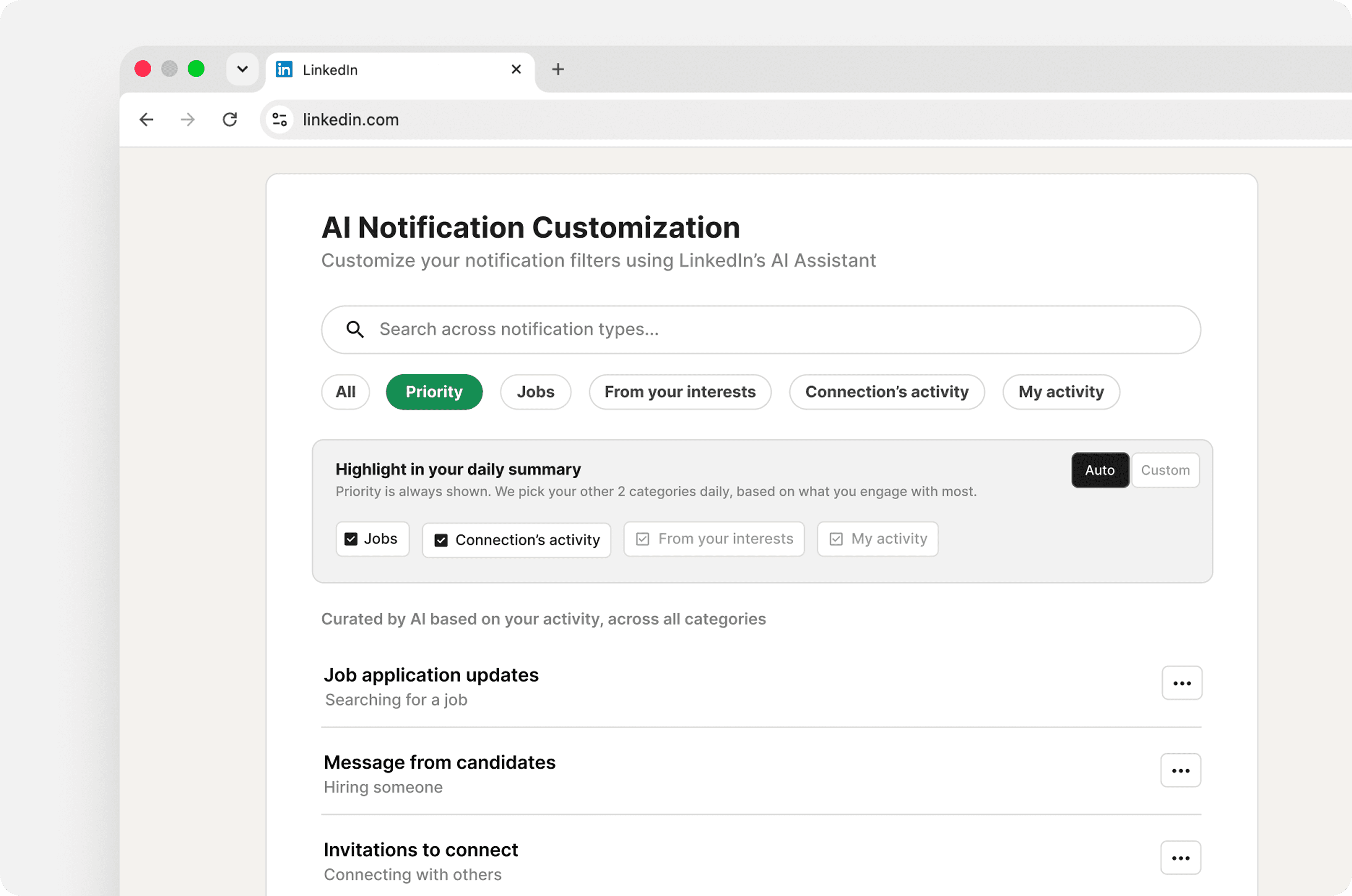
The daily summary displays three color-coded stats tiles. Priority is always shown; the other two are chosen automatically, based on engagement and notification volume. But AI algorithm won’t always guess right, so I added a “Customize highlight” option with an Auto/Custom toggle: Auto shows the AI’s current picks (read-only), while Custom lets users manually lock in their own two categories, with a one-tap reset back to Auto. Automation stays the default, but it’s never the only option.
Auto/Custom toggle that gives users full freedom
design decision 04
Solving Priority's cold start
A brand new user has no engagement history yet, so Priority’s curation has nothing to work from; it would launch empty. Since Priority’s own menu only supports removing items, there’s no way to populate it from within the tab itself. The empty state explains this simply and directs users to the All tab, where “Also show in Priority” lets them manually add notifications while the AI has nothing to learn from yet.
Routes user to the All tab with clear explanation of the empty state
design decision 05
Cutting a feature that duplicated the tabs

The daily summary section initially had an expanded “See all activity” view that grouped notifications thematically across categories—connection’s new jobs, posts from followed pages, alumni updates—regardless of tab.
But it ended up duplicating the job the notification tab system already did, without a clearly distinct purpose. The expanded view was cut in favor of one consistent way to browse: tabs, filtered, chronological.
impact
What this actually changes for users
Notification overload
AI surfaces what's relevant instead of one unclassified feed.
Scanning time
Urgent items rise to the top, with context on why they matter
Interaction effort
Users act directly from the notification summary itself
In practice, this means users can scan their day in one AI-curated summary instead of full-scrolling and finding high-stakes items faster.
tradeoff
What this cost
Five notification categories plus a reassignment mechanism is definitely more complex than LinkedIn’s current four, and Priority’s curation is only as good as the engagement history behind it; new users get the least intelligent version of the feature when they first experience it.
reflection
Key Takeaways
Control vs. Convenience
Most of the hard decisions in this project weren’t about making AI smarter. They were about letting users override or control AI without losing the convenience automation provides in the first place.
Fitting into existing models
This project was not about bolting on a cool AI feature—it’s about whether it seamlessly fits into an existing system in a way that genuinely benefits the user.